4 Maps
This chapter presents a prototype for a map representation of both average indicator values and of uncertainty therein. Most of it is focused on a side-by-side presentation of two zoomable maps: one for average values and one for the coefficient of variation (= a measure of uncertainty).
At the end, we also mention some additional ideas that we did not implement (fully) yet but may be worth trying out.
4.1 Raw data
We have not written code yet for making raw data maps, but this would entail just small changes to the proposed solutions for maps of scaled data (below).
4.2 Scaled data
4.2.1 Jerv
4.2.1.1 Prepare NI data
The jerv (wolverine) data was downloaded using the R/singleIndicator.R script and the importDatasetApi() function, and subsequently the assembleNiObject() function, so now we can simply import it.
jerv <- readRDS("data/Jerv_assemebled.rds")This data file contains the raw data in the form of expected values for each BSunits (municipalities). But we actually want to keep the original geometries of the eight “rovviltregioner”, and so we need to focus in the ICunits instead.
par(mar=c(9,5,1,1))
barplot(jerv$indicatorValues$`2019`$expectedValue,
names.arg = jerv$indicatorValues$`2019`$ICunitName,
las=2,
ylab = "Estimated number of\nwolverine in 2019")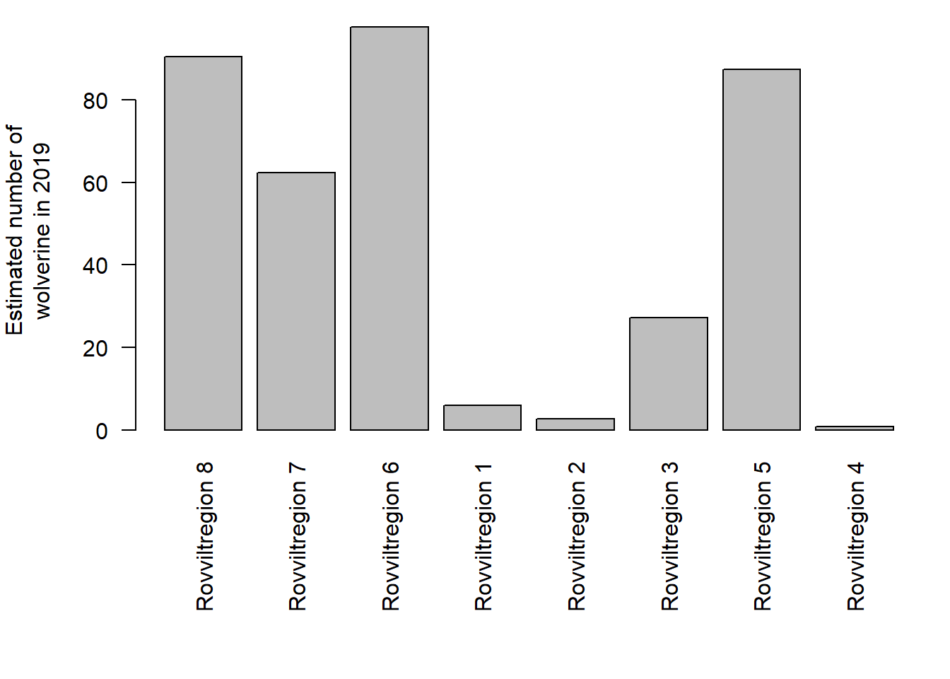
Figure 4.1: Estimated number of wolverine in 2019, exported from the NI database.
The data also contains upper and lower quantiles, but we can also get the full probability distribution and sample from it to get standard deviations, but also as probability functions that we can sample from:
# bruker tradOb siden custumDist er NA. Dette er ikke en generisk løsning.
obstype <- rep("tradObs", nrow(jerv$indicatorValues$'2019'))
#myYears <- as.character(c(1990,2000,2010,2014,2019))
myYears <- as.character(c(2019))
for(i in 1:length(myYears)){
# print(i)
myMat <- NIcalc::sampleObsMat(
ICunitId = jerv$indicatorValues[[i]]$ICunitId,
value = jerv$indicatorValues[[i]]$expectedValue,
distrib = jerv$indicatorValues[[i]]$distributionFamilyName,
mu = jerv$indicatorValues[[i]]$distParameter1,
sig = jerv$indicatorValues[[i]]$distParameter2,
customDistribution = jerv$indicatorValues[[i]]$customDistribution,
obsType = obstype,
nsim = 1000
)
assign(paste0("myMat", myYears[i]), myMat)
}
par(mfrow = c(1,2))
hist(myMat2019[1,], main = "Rovviltregion 1", xlab = "")
hist(myMat2019[8,], main = "Rovviltregion 8", xlab = "")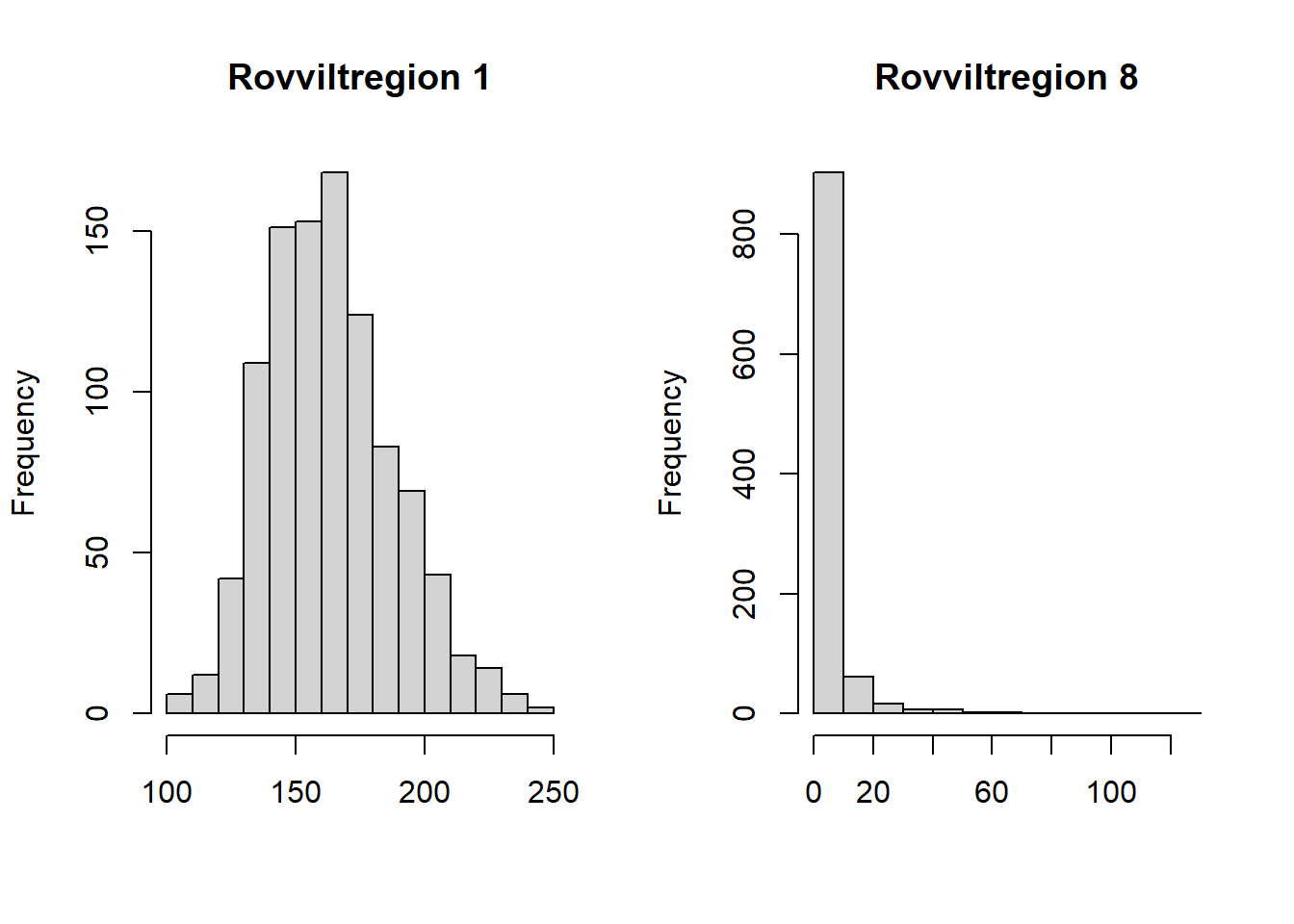
Figure 4.2: Probability distribuition for the number of wolverine, resamlped using data from the NI database and R function in the NIcalc-package.
For some reason the expected values are far from the mean of these distributions. Anders did this exercise once before, and did not get this problem then. We think the difference is that we use eco = NULL this time, in the importDatasetApi(), and this cause the output to somehow split into forest and alpine ecosystems. We will ignore this here for this example.
We can also get the reference values in the same way, and then divide one by the other to get scaled values
myMatr <- NIcalc::sampleObsMat(
jerv$referenceValues$ICunitId,
jerv$referenceValues$expectedValue,
jerv$referenceValues$distributionFamilyName,
mu = jerv$referenceValues$distParameter1,
sig = jerv$referenceValues$distParameter2,
customDistribution = jerv$referenceValues$customDistribution,
obsType = obstype,
nsim =1000
)
temp <- colSums(myMat2019)/colSums(myMatr)
hist(temp, xlab = "Scaled indicator value for wolverine",main="")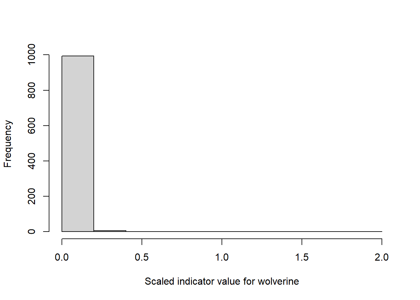
Figure 4.3: Example distribution of scaled indicator values for wolverine.
Then we will create a data frame with the mean indicator values and the SD.
library(matrixStats)
#> Warning: package 'matrixStats' was built under R version
#> 4.1.3
#>
#> Attaching package: 'matrixStats'
#> The following object is masked from 'package:dplyr':
#>
#> count
jerv_tbl <- data.frame("raw2019" = round(rowMeans(myMat2019), 2),
"sd2019" = round(matrixStats::rowSds(myMat2019), 2),
"ref" = round(rowMeans(myMatr), 2))
jerv_tbl$scaled <- round(jerv_tbl$raw2019/jerv_tbl$ref, 2)
jerv_tbl$cv <- round(jerv_tbl$sd2019/jerv_tbl$raw2019, 2)
jerv_tbl$region <- jerv$indicatorValues$`2019`$ICunitName
DT::datatable(jerv_tbl)Figure 4.4: Table showing the different parameters and summary statistics for the wolverine indicator.
This is a special case maybe, because the sd is often larger than the mean.
Note that we could use inbuilt NIcalc functions to get the indicator value, like we do below, but that will aggregate to regions, and we want to keep the original geometry.
jervComp <- NIcalc::calculateIndex(
x = jerv,
nsim = 1000,
awBSunit = "terrestrialArea",
fids = F, # should fidelities be ignored in
# the calculation of Wi?
tgroups = F, # should grouping of indicators
# into trophic and key indicator
# groups be ignored
keys = "specialWeight", #"ignore",
)
#> Indices for NIunits 'wholeArea', 'E', 'S', 'W', 'C', 'N'
#> and years '1990', '2000', '2010', '2014', '2019' will be calculated.
#> The 30 index distributions will each be based on 1000 simulations.
#> There are 8 ICunits with observations in data set 'jerv'.
#>
#> Calculating weights that are the same for all years .....
#>
#> Sampling reference values .....
#>
#> Sampling and scaling indicator observations from 1990 .....
#>
#> Sampling and scaling indicator observations from 2000 .....
#>
#> Sampling and scaling indicator observations from 2010 .....
#>
#> Sampling and scaling indicator observations from 2014 .....
#>
#> Sampling and scaling indicator observations from 2019 .....
plot(jervComp$wholeArea)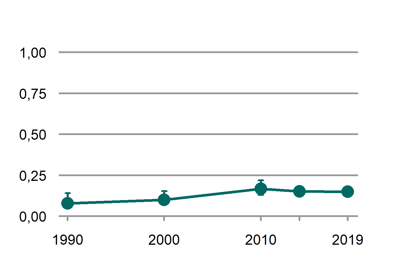
Figure 4.5: The scaled indicator values for wolverine across Norway.
4.2.1.2 Get geometries
Then we can get the spatial geometries associated with the data. These are the so-called “rovviltregioner”. There are eight of them. They are actually linked to the BS-units (municipalities), but we don’t want to plot the outlines of the municipalities. The geometries for the appropriate spatial units of each indicator can be downloaded in .json format via a previously created API for the nature index database: https://ninweb08.nina.no/NaturindeksAPI/index.html To get the file for a specific indicator, one needs to enter the numerical indicator id under “/api/Indicator/{id}/Areas” and then click download. We then converted the .json file to shapefiles for use in R.
path <- "P:/41201612_naturindeks_2021_2023_database_og_innsynslosning/Pilot_Forbedring_Innsynsløsning/Shapefiles/Jerv"
library(sf)
#> Warning: package 'sf' was built under R version 4.1.3
#> Linking to GEOS 3.10.2, GDAL 3.4.1, PROJ 7.2.1; sf_use_s2()
#> is TRUE
rov <- sf::read_sf(path)
rov <- sf::st_make_valid(rov)
rov <- rov[rov$area!="DEF jerv",]Clip it against the outline of Norway to make it look more pretty
path <- "data/outlineOfNorway_EPSG25833.shp"
nor <- sf::read_sf(path)
nor <- st_transform(nor, crs=st_crs(rov))
rov <- st_intersection(rov, nor)
#> Warning: attribute variables are assumed to be spatially
#> constant throughout all geometries4.2.1.3 Link data and geometries
Here we copy the data from the table into the geo-file.
rov$scaledIndicator <- jerv_tbl$scaled[match(rov$area, jerv_tbl$region)]
rov$cv <- jerv_tbl$cv[match(rov$area, jerv_tbl$region)]
rov$raw <- jerv_tbl$raw2019[match(rov$area, jerv_tbl$region)]Then we can attempt to create some nice example maps where the indicator uncertainty is shown parallel to the scaled values.
# colour palette with 10 colours
pal <- grDevices::colorRampPalette(NIviz_colours[["IndMap_cols"]])(10)
one <- tm_shape(rov)+
tm_polygons(col="scaledIndicator",
border.col = "white",
style = "cont",
breaks = seq(0,1, length.out = 11),
palette = pal)
two <- tm_shape(rov)+
tm_polygons(col="cv",
border.col = "black")
#three <- tm_shape(rov)+
# tm_polygons(col="raw",
# border.col = "white")
tmap_mode("view")
#> tmap mode set to interactive viewing
tmap_arrange(one, two,
sync=T,
widths = c(.75, .25),
heights = c(1, 0.5)
)