Make grid
grid100 <- sf::st_make_grid(lev_crop,
                 cellsize = 100) |>
  st_sf()

id <- sample(1:nrow(grid100))
grid100 <- grid100 |>
  add_column(id = id)

plot(grid100)
Here I will exemplify the frequency based metric using a method similar to the 7TK variable in NiN.
Making a 100x100m grid over the stydy area (the smaller zoomed in area from Figure 2.2).
grid100 <- sf::st_make_grid(lev_crop,
cellsize = 100) |>
st_sf()
id <- sample(1:nrow(grid100))
grid100 <- grid100 |>
add_column(id = id)
plot(grid100)
Then I intersect the trenches data with the grid.
trench_in_cell <- st_intersection(lev_crop, grid100)
#trench_in_cell <- st_join(lev_crop, grid100, join=st_within)
#saveRDS(trench_in_cell, "data/trench_in_cell.RDS")
trench_in_cell |>
  ggplot()+
  geom_sf(data = grid100)+
  geom_sf(aes(color = factor(id),
              fill = factor(id)))+
  guides(fill = "none",
         color = "none") +
  theme_bw()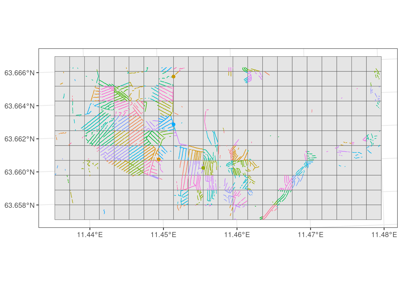
Then I collapse the dataframe into unique grid cell IDs and mark these as 1’s (presenses).
I then join this data with grid100 and plot it.
grid100_pa <- trench_in_cell |>
  st_set_geometry(NULL) |>
  group_by(id) |>
  summarise(n = n()) |>
  add_column(trenched = 1) |>
  select(-n) |>
  right_join(grid100, by = "id") |>
  mutate(trenched = case_when(
    is.na(trenched) ~ 0,
    .default = trenched
  )) |>
  st_as_sf()

grid100_pa |>
  ggplot() +
  geom_sf(aes(fill = factor(trenched)),
          na.rm = TRUE)+
  theme_bw() +
  geom_sf(data = trench_in_cell)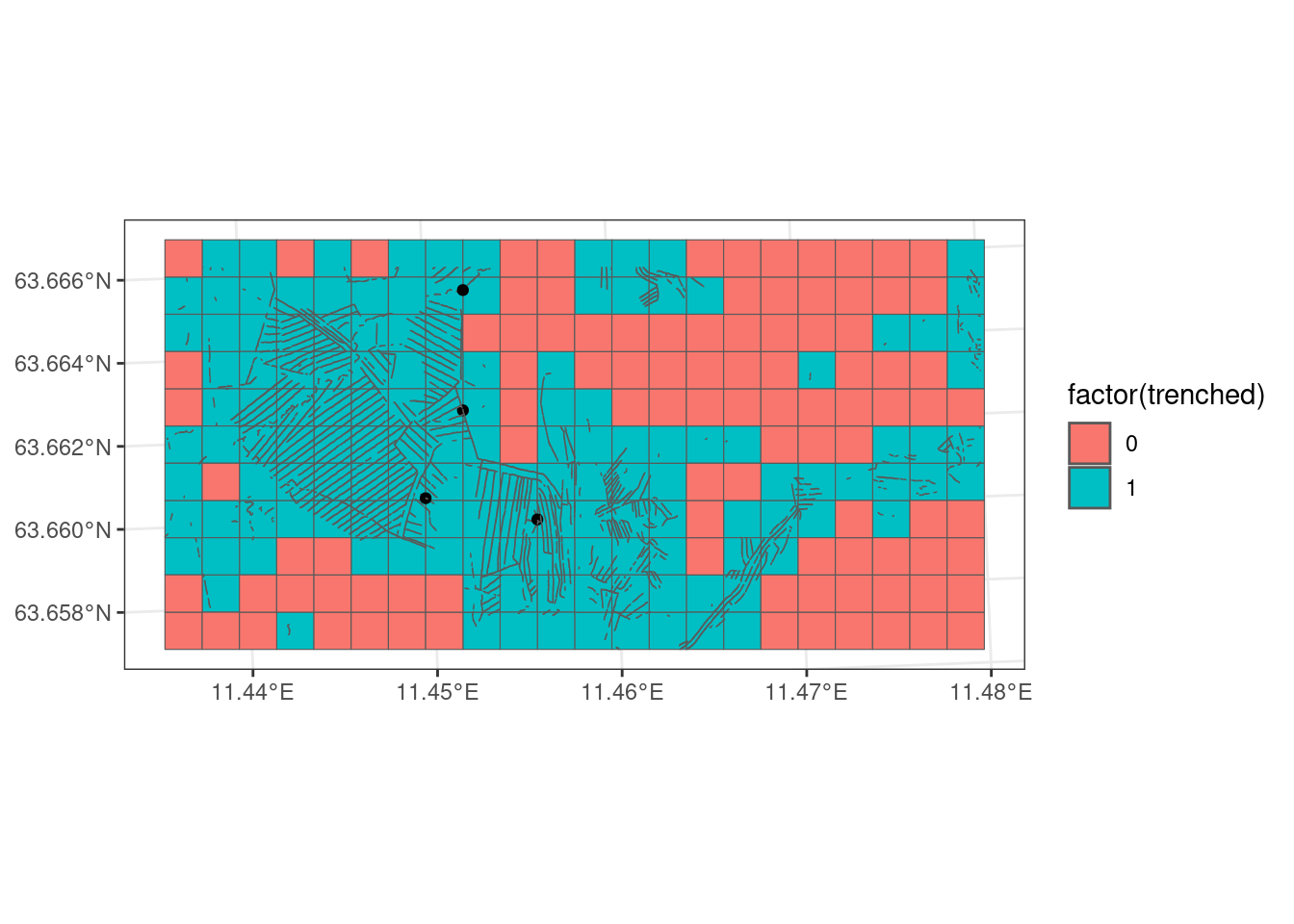
The example in Figure 5.3 is done on 100x100 grid cell just for illustration. I will now do the same, but on 10x10m grid cells, and then calculate the proportion of trenched 10x10 grid cells inside each 100x100m grid cell. The proportion of 10x10 grid cells could be aggregated to any geometry, such as a region, a municipality or a project area.
grid10 <- sf::st_make_grid(grid100,
                cellsize = 10) |>
  st_sf()

# align perfectly with grid100 and carry the id from grid100 to grid10
grid10 <- grid10 |>
  st_intersection(grid100) |>
  mutate(
    area = units::drop_units(
      st_area(sf..st_make_grid.grid100..cellsize...10.)),
    exclude = case_when(
      area < 50 ~ 1,
      .default = 0
         )) |>
  filter(exclude != 1)


id10 <- sample(1:nrow(grid10))
grid10 <- grid10 |>
  add_column(id10 = id10) |>
  select(id, id10)

#plot(grid10)

trench_in_cell10 <- st_intersection(lev_crop, grid10)

grid100_freq <- trench_in_cell10 |>
  st_set_geometry(NULL) |>
  group_by(id10) |>
  summarise(n = n()) |>
  ungroup() |>
  add_column(trenched = 1) |>
  select(-n) |>
  right_join(grid10, by = "id10") |>
  mutate(trenched = case_when(
    is.na(trenched) ~ 0,
    .default = trenched
  )) |>
  group_by(id) |>
  summarise(freq = mean(trenched)*100) |>
  #st_as_sf() |>
  #st_intersection(grid100) |>
  right_join(grid100, by = "id") |>
  st_as_sf()

grid100_freq |>
  ggplot() +
  geom_sf(aes(fill = freq))+
  theme_bw() +
  geom_sf(data = trench_in_cell)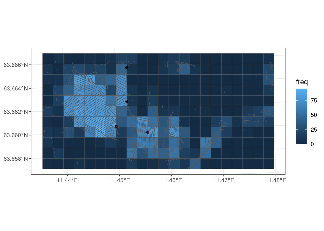
Figure 5.4 shows the trenching variable in its raw units (%) over the entire study area. The next step is then to exclude areas that are not part of the target ecosystem, i.e. not part of the accounting area. This can be done on the 100x100 grid level, put probably more correct to do it at the 10x10m grid level. To start I mask againt open mires only. Later I add AR5 mires.
# make the ecosystem delineation map into polygons
mire <- st_as_sf(mire10_crop, merge = T)

grid100_freq2 <- trench_in_cell10 |>
  st_intersection(mire) |>
  st_drop_geometry() |>
  group_by(id10) |>
  summarise(n = n()) |>
  ungroup() |>
  add_column(trenched = 1) |>
  select(-n) |>
  right_join(grid10, by = "id10") |>
  mutate(trenched = case_when(
    is.na(trenched) ~ 0,
    .default = trenched
  )) |>
  st_as_sf() |>
  st_intersection(mire) |>
  st_drop_geometry() |>
  group_by(id) |>
  summarise(freq = mean(trenched)*100) |>
  #st_as_sf() |>
  #st_intersection(grid100) |>
  right_join(grid100, by = "id") |>
  st_as_sf() |>
  st_intersection(mire)

high <- "red"
low <- "green"


grid100_freq2 |>
  ggplot() +
  geom_sf(aes(fill = freq))+
  theme_bw() +
  geom_sf(data = trench_in_cell)+
  scale_fill_gradient("Frequency of trenches", low = low,
        high = high)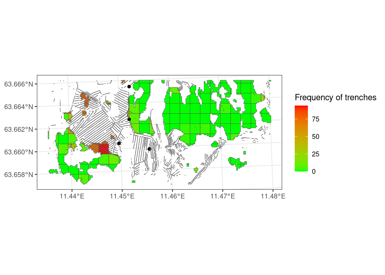
The three grid cells with the highest proportion of trenched 10x10m grid cells have 94, 86, and 83 percent. The three cells visible in Figure 5.5 with the darkest red color all seem to be relatively densely trenched. Probably we need to adjust the threshold value so that at least these three all get quite low indicator values. I will for now set 10% as the threshold value (X60) and 50% as the low reference point (X0). These values are updated later (see Chapter 6 and Chapter 7). I will fit the data using a sigmoid function to soften arbitrary break points.
ea_normalise(
  data = grid100_freq2,
  vector = "freq",
  upper_reference_level = 50,
  lower_reference_level = 0,
  break_point = 10,
  scaling_function = "sigmoid",
  reverse=T,
  plot = T)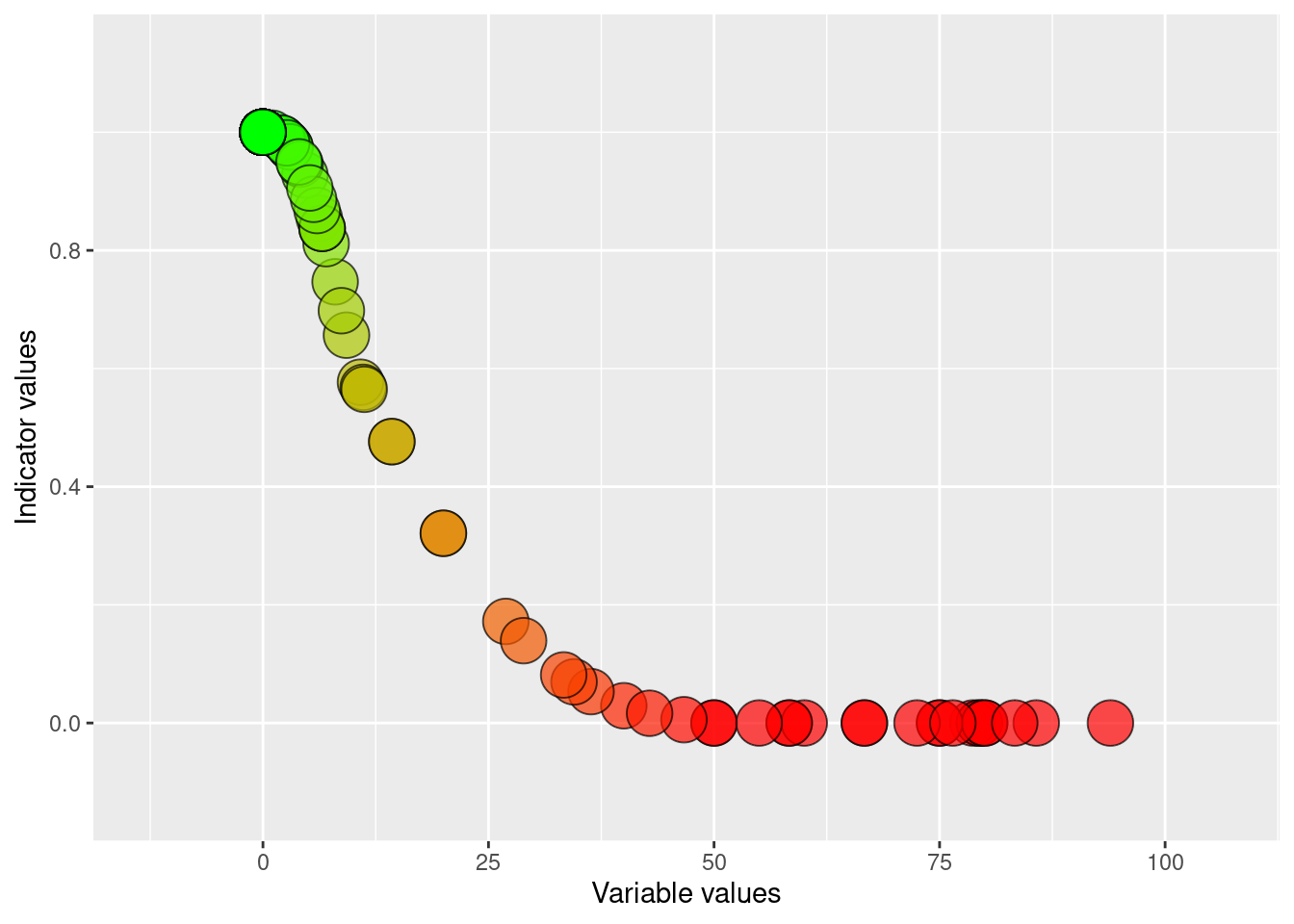
grid100_freq2 <- grid100_freq2 |>
  mutate(indicator =
           ea_normalise(
  data = grid100_freq2,
  vector = "freq",
  upper_reference_level = 50,
  lower_reference_level = 0,
  break_point = 10,
  scaling_function = "sigmoid",
  reverse=T,
  plot = F))

grid100_freq2 |>
  ggplot() +
  geom_sf(aes(fill = indicator))+
  theme_bw() +
  geom_sf(data = trench_in_cell)+
  scale_fill_gradient(
    "Indicator value",
    low = high,
    high = low)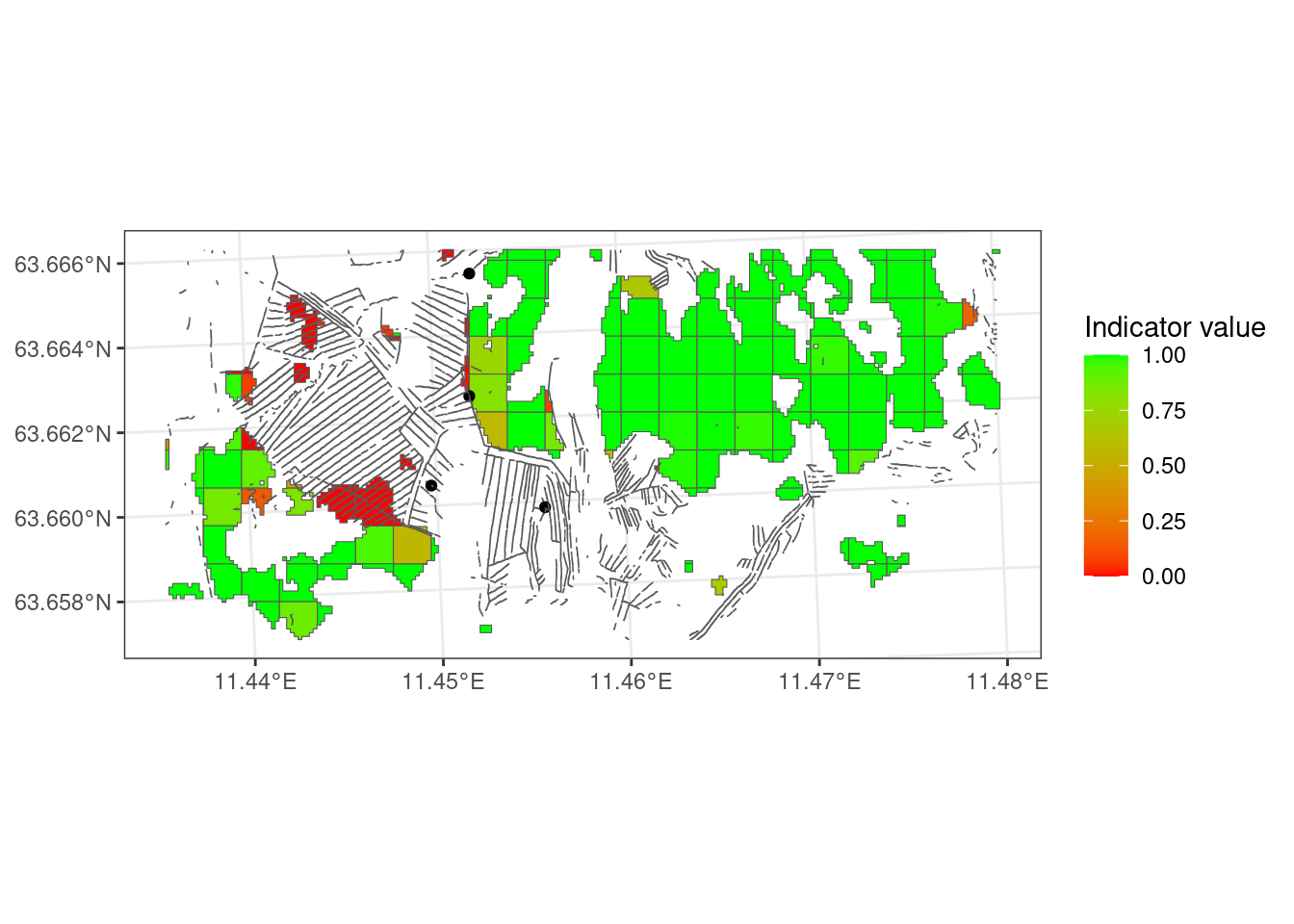
I think the indicator values are reasonably well representative of what I expect the ecological effect of the different trenching densities to be. These reference points are, however, not informed with any data.
grid100_freq2 <- grid100_freq2 |>
  mutate(area = st_area(sf..st_make_grid.lev_crop..cellsize...100.))

ind_dist_open <- NULL
for(i in 1:1000){
  ind_dist_open[i] <-
    mean(sample(grid100_freq2$indicator,
       nrow(grid100_freq2),
       replace = TRUE,
       prob = grid100_freq2$area))
}

#ind_dist_open |>
#  as_tibble() |>
#  ggplot()+
#  geom_density(aes(x = value),
#    fill = "burlywood") +
# labs(x = "Indicator value")Now let’s calculate the indicator value based on the orange areas (the third map) and the green areas (the last map) in Figure 2.4, and see if it looks very different what we had.
grid100_freq3 <- trench_in_cell10 |>
  st_intersection(ar5_nonOpen) |>
  st_drop_geometry() |>
  group_by(id10) |>
  summarise(n = n()) |>
  ungroup() |>
  add_column(trenched = 1) |>
  select(-n) |>
  right_join(grid10, by = "id10") |>
  mutate(trenched = case_when(
    is.na(trenched) ~ 0,
    .default = trenched
  )) |>
  st_as_sf() |>
  st_intersection(ar5_nonOpen) |>
  st_drop_geometry() |>
  group_by(id) |>
  summarise(freq = mean(trenched)*100) |>
  right_join(grid100, by = "id") |>
  st_as_sf() |>
  st_intersection(ar5_nonOpen)

grid100_freq3 <- grid100_freq3 |>
  mutate(indicator =
           ea_normalise(
  data = grid100_freq3,
  vector = "freq",
  upper_reference_level = 50,
  lower_reference_level = 0,
  break_point = 10,
  scaling_function = "sigmoid",
  reverse=T,
  plot = F))

grid100_freq3 |>
  ggplot() +
  geom_sf(aes(fill = indicator))+
  theme_bw() +
  geom_sf(data = trench_in_cell)+
  scale_fill_gradient(
    "Indicator value",
    low = high,
    high = low)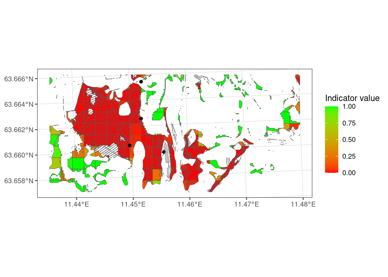
Figure 5.8 is a lot more red than Figure 5.7!
grid100_freq3 <- grid100_freq3 |>
  mutate(area = st_area(sf..st_make_grid.lev_crop..cellsize...100.))

ind_dist_nonopen <- NULL
for(i in 1:1000){
  ind_dist_nonopen[i] <-
    mean(sample(grid100_freq3$indicator,
       nrow(grid100_freq3),
       replace = TRUE,
       prob = grid100_freq3$area))
}

#ind_dist_nonopen |>
#  as_tibble() |>
#  ggplot()+
#  geom_density(aes(x = value),
#    fill = "burlywood") +
#  labs(x = "Indicator value")
Let’s do the same, but include all AR5 mires, and the little bit extra areas from the open mire map.
grid100_freq4 <- trench_in_cell10 |>
  st_intersection(peatlands) |>
  st_drop_geometry() |>
  group_by(id10) |>
  summarise(n = n()) |>
  ungroup() |>
  add_column(trenched = 1) |>
  select(-n) |>
  right_join(grid10, by = "id10") |>
  mutate(trenched = case_when(
    is.na(trenched) ~ 0,
    .default = trenched
  )) |>
  st_as_sf() |>
  st_intersection(peatlands) |>
  st_drop_geometry() |>
  group_by(id) |>
  summarise(freq = mean(trenched)*100) |>
  right_join(grid100, by = "id") |>
  st_as_sf() |>
  st_intersection(peatlands)

grid100_freq4 <- grid100_freq4 |>
  mutate(indicator =
           ea_normalise(
  data = grid100_freq4,
  vector = "freq",
  upper_reference_level = 50,
  lower_reference_level = 0,
  break_point = 10,
  scaling_function = "sigmoid",
  reverse=T,
  plot = F))

# Option to have uniform class:
grid100_freq4 <- grid100_freq4 |>
  st_cast("MULTIPOLYGON") |>
  st_cast("POLYGON")

#saveRDS(grid100_freq4, "data/grid100_freq4.rds")

grid100_freq4 |>
  ggplot() +
  geom_sf(aes(fill = indicator))+
  theme_bw() +
  geom_sf(data = trench_in_cell)+
  scale_fill_gradient(
    "Indicator value",
    low = high,
    high = low)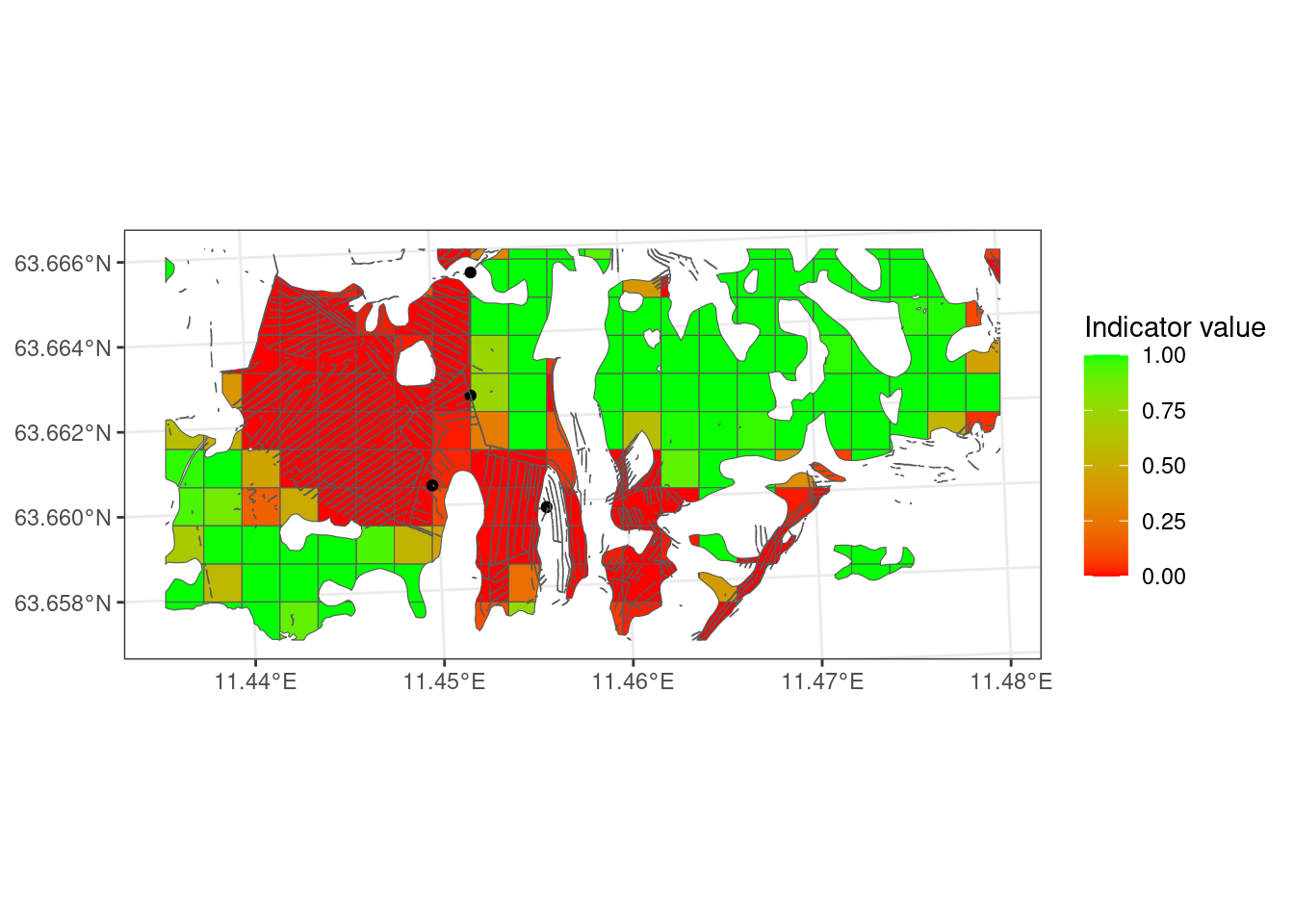
grid100_freq4 <- grid100_freq4 |>
  mutate(area = st_area(sf..st_make_grid.lev_crop..cellsize...100.))

ind_dist_all <- NULL
for(i in 1:1000){
  ind_dist_all[i] <-
    mean(sample(grid100_freq4$indicator,
       nrow(grid100_freq4),
       replace = TRUE,
       prob = grid100_freq4$area))
}

ind_dist_comb <- tibble(
  open = ind_dist_open,
  forested = ind_dist_nonopen,
  all = ind_dist_all
) |>
  pivot_longer(
    cols = everything(),
    names_to = "extent",
values_to = "indicator_value")ind_dist_comb |>
ggplot(
aes(
x = indicator_value,
y = extent,
fill = after_stat(x))
) +
geom_density_ridges_gradient(
bandwidth=.005,
quantile_lines = TRUE,
quantiles = c(0.025, .5, 0.975)
) +
scale_fill_distiller(palette = "RdYlGn",
direction = 1) +
theme_bw(base_size = 15) +
guides(fill = "none") +
geom_vline(xintercept = .6,
size=1.2,
lty=2) +
theme(axis.text.x = element_text(angle=45, hjust=1, vjust=1))+
labs(y = "", x = "Indicator values")+
xlim(c(0,1)
)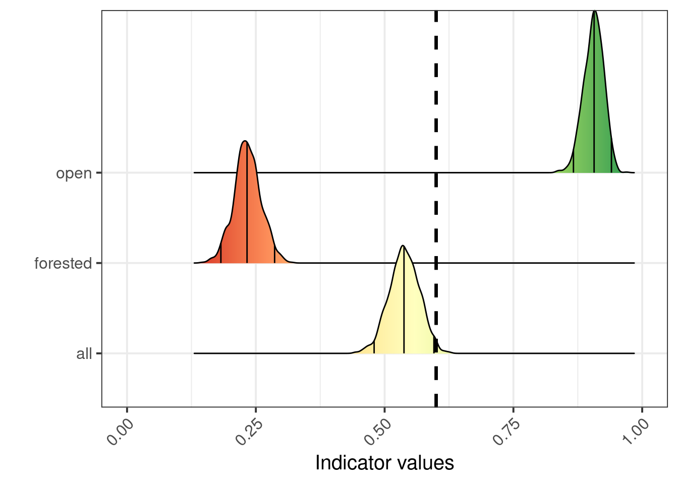
Figure 5.10 shows us that the ecosystem delineation makes a huge difference on the indicator values. Combining AR5 and the open mire model gives a mean indicator value of 0.54, reflection quite predictably the rather binary situation in Figure 5.9 where half the area is dark red and the other half is green.
I think it makes most sense to combine AR5 and the open mire model for this indicator. All indicators used in the same assessment must use the same overall ecosystem delineation, but it is still possible that one indicator related only to a smaller part of that delineation. If using the AR5+open mire combination is not agreeable, then using AR5, alternatively the new Ecosystem Map of Norway (Strand et al. 2023), would be preferable to using just the open mire model.