Import data
dat <- readRDS("data/expertElicitation.RDS")Here we show the results from the two session of expert elicitation explained in Chapter 6.
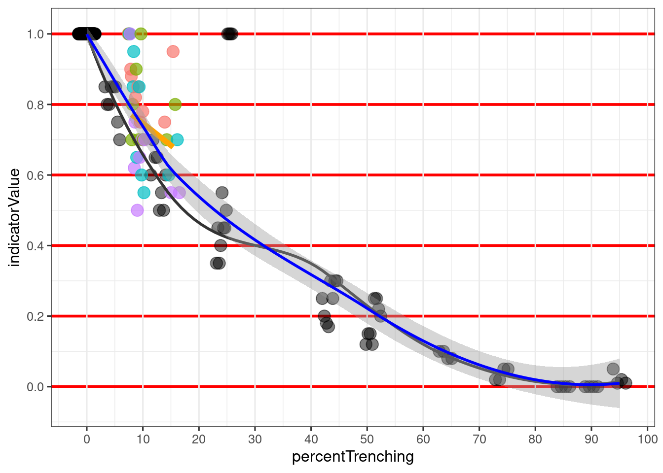
The black circles in Figure 7.1 shows a remarkable consistency in the experts answers from the first communal session, and a strong relationship between trenching frequency and (perceived) indicator values. The exception is for one point around 25% trenching frequency where everybody scored an indicator value of 1, due to a common agreement that the trenches in the image did not represent real trenches, but was rather an artifact of the model. There are artefacts in the trenching map, and probably also will be in the final national trenching map. We therefore argue that images with such artefacts should be allowed to influence the choice of reference levels. However, this data point had relatively little influence on the loess smoothers in Figure 7.1 but there were more possible artifact assessed during the second elicitation session.
Based on the first session and the expert scoring of 16 images of varying trenching frequency, we found that X60 should be anchored to just around 10% trenching frequency (black line in Figure 7.1), and the x100 can be anchored at around 85-90%. However, there is still a few non-zero values at the far right of the figure, indicator that perhaps X100 should conservatively be set higher, for example to 100%.
In the first session we experienced that there was a steep decline in indicator values in the beginning, with trenching frequencies <20%. We therefore scored yet another 9 cases from this critical range, but this time the experts did not get to discuss the images with the others. This led to much higher variation in responses, and generally higher indicator values (colored circles and orange regression line in Figure 7.1).
dat <- readRDS("data/expertElicitation.RDS")append <- dat |>
mutate(percentTrenching = 0,
indicatorValue = 1,
Figure = 0)
dat |>
#filter(Figure < 21) |>
# add zeros
bind_rows(append) |>
ggplot(aes(x = percentTrenching,
y = indicatorValue)) +
geom_point(data = ~ filter(.x, Figure <21),
size = 4,
alpha=.5,
fill = "grey20",
position = position_dodge2(width=3)) +
theme_bw( base_size = 12) +
scale_y_continuous(breaks = seq(0,1, by=.2)) +
scale_x_continuous(breaks = seq(0,100, by=10)) +
theme(panel.grid.major.y = element_line(color = "red",
linewidth = 1)) +
geom_point(data = ~ filter(.x, Figure >20),
aes(color = Person),
size = 4,
alpha=.7,
#color = "orange3",
position = position_dodge2(width=3)) +
geom_smooth(data = ~ filter(.x, Figure <21),
color = "grey20",
se=F)+
geom_smooth(data = ~ filter(.x, Figure >20, indicatorValue!=1),
method = "lm",
se= F,
colour = "orange",
linewidth = 2)+
geom_smooth(color = "blue") +
guides(color = "none")
One reason for the generally much higher values in the second session, using individual expert elicitation, could be that there were by chance more images showing trenches that the experts interpreted as artifacts of the model, and not as real trenches. This implies that is a future trenching map is able to reduce these artifact, then the RLs should be recalculated.
Combining data from the two expert elicitation sessions we end up with the blue line in Figure 7.1, and the following reference levels: