20 Scaling functions
Author. Anders L. Kolstad
March 2023
Superseeded : The functionality explained here is moved over to the eaTools package. Please see the documentation there for updated examples.
Indicator for ecological condition may be scaled against a reference value to become normalised and hence comparable. In SEEA EA, un-scaled or raw indicators are not called indicators at all, but simply referred to as variables, and I will use this distinction here. Scaling variables against reference conditions can be done in many ways. Here are some examples, for inspiration.
set.seed(123)Define plotting aesthetics
low <- "red"
high <- "green"
ridge <- geom_density_ridges_gradient(scale = 3, size = .3)
myColour <- "black"
mySize <- 10
myAlpha <- .7
myShape <- 21
Create random raw data for two variables
dat <- data.frame(variable1 = rnorm(50, 10, 4),
                  variable2 = rnorm(50, 30, 3))

temp <- data.table::melt(setDT(dat))
#> Warning in melt.data.table(setDT(dat)): id.vars and
#> measure.vars are internally guessed when both are 'NULL'.
#> All non-numeric/integer/logical type columns are considered
#> id.vars, which in this case are columns []. Consider
#> providing at least one of 'id' or 'measure' vars in future.

ggplot(temp,
       aes(x = value,
           y = variable,
           fill = stat(x)))+
  ridge+
  scale_fill_gradient(low = low, high = high)
#> Warning: `stat(x)` was deprecated in ggplot2 3.4.0.
#> ℹ Please use `after_stat(x)` instead.
#> This warning is displayed once every 8 hours.
#> Call `lifecycle::last_lifecycle_warnings()` to see where
#> this warning was generated.
#> Picking joint bandwidth of 1.22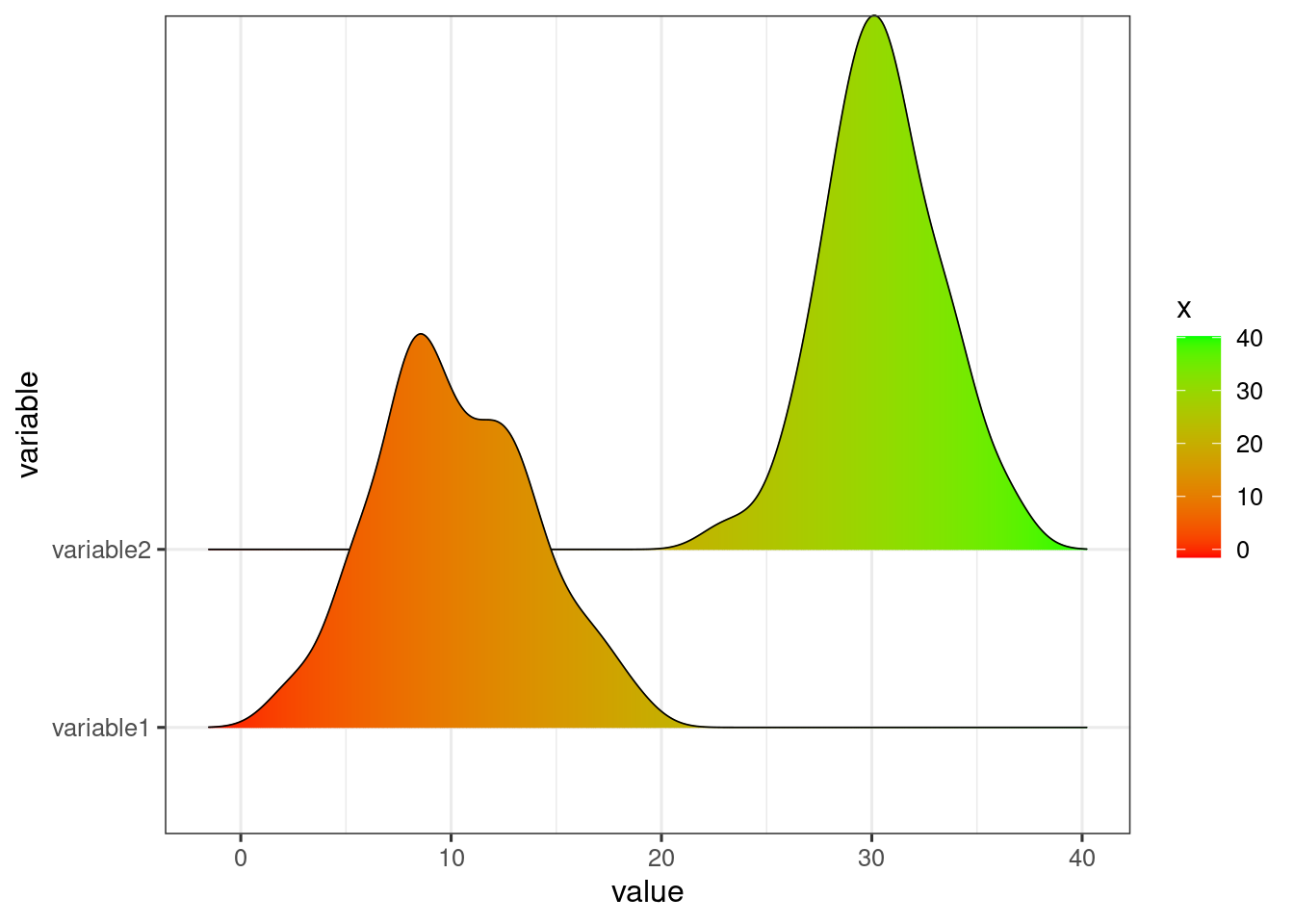
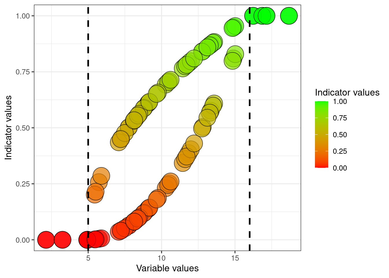
Lets say that the reference condition for variable1 to equal 16, and for variable 2 its 35
dat$referenceHigh1 <- 16
dat$referenceHigh2 <- 35
20.1 Linear, with a natural zero
We can scale our variable linearly, saying that all values above 12 represents ‘perfect’ condition. We also assume that the value zero is the worst possible condition for this variable. To do this we divide by the reference value, and truncate values above it.
dat$indicator1 <- dat$variable1/dat$referenceHigh1
dat$indicator1[dat$indicator1>1] <- 1

dat$indicator2 <- dat$variable2/dat$referenceHigh2
dat$indicator2[dat$indicator2>1] <- 1
temp <- melt(setDT(dat),
             measure.vars = c("indicator1", "indicator2"))
ggplot(dat)+
  geom_point(
    aes(x = variable1, y = indicator1, fill = indicator1),
             colour = myColour,
             size   = mySize,
             alpha  = myAlpha,
             shape  = myShape)+
  geom_vline(xintercept = dat$referenceHigh1[1],
             linetype = "dashed",
             size =2)+

  geom_point(aes(x = variable2, y = indicator2, fill = indicator2),
             colour = myColour,
             size   = mySize,
             alpha  = myAlpha,
             shape  = myShape)+
  geom_vline(xintercept = dat$referenceHigh2,
             linetype = "dashed",
             size =2)+
  ylab("Indicator values")+
  xlab("Variable values")+

  scale_fill_gradient("Indicator values", low = low, high = high)
#> Warning: Using `size` aesthetic for lines was deprecated in ggplot2
#> 3.4.0.
#> ℹ Please use `linewidth` instead.
#> This warning is displayed once every 8 hours.
#> Call `lifecycle::last_lifecycle_warnings()` to see where
#> this warning was generated.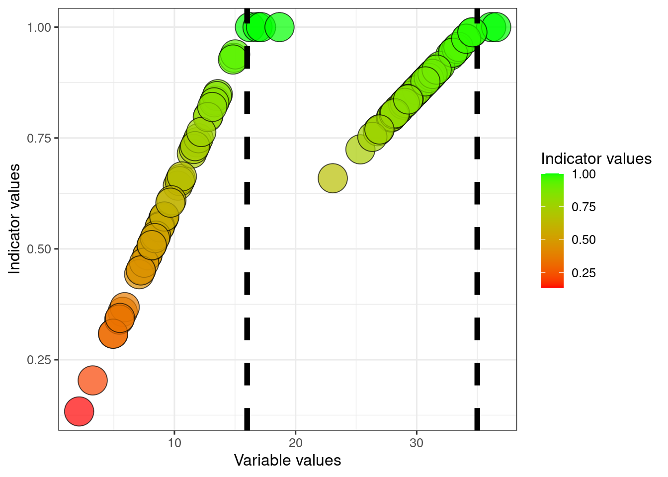
To reverse what is good and what is bad condition: change the sign and add one.
ggplot(dat)+
  geom_point(
    aes(x = variable1, y = indicator1*(-1)+1, fill = indicator1*(-1)+1),
             colour = myColour,
             size   = mySize,
             alpha  = myAlpha,
             shape  = myShape)+
  geom_vline(xintercept = dat$referenceHigh1[1],
             linetype = "dashed",
             size =2)+

  ylab("Indicator values")+
  xlab("Variable values")+

  scale_fill_gradient("Indicator values", low = low, high = high)
The two indicators become more comparable now that they are normalised. At least this is true around the reference value. But perhaps a variable value around 25 for variable2 is actually quite bad. In the above example I have assumed that the value zero is the worst possible value, but that may not always be the case.
20.2 Linear, with defined lower limit
We can also say that the worst possible condition for these variables is not zero, but for example say that it is 5 for variable1 and 28 for variable2.
dat$referenceLow1 <- 5
dat$referenceLow2 <- 28
We can then normalise the data between these two reference values.
dat$indicator1_LowHigh <- (dat$variable1-dat$referenceLow1)/(dat$referenceHigh1 - dat$referenceLow1)
dat$indicator1_LowHigh[dat$indicator1_LowHigh <0] <- 0
dat$indicator1_LowHigh[dat$indicator1_LowHigh >1] <- 1

dat$indicator2_LowHigh <- (dat$variable2-dat$referenceLow2)/(dat$referenceHigh2 - dat$referenceLow2)
dat$indicator2_LowHigh[dat$indicator2_LowHigh <0] <- 0
dat$indicator2_LowHigh[dat$indicator2_LowHigh >1] <- 1
ggplot(dat)+
  geom_point(
    aes(x = variable1, y = indicator1_LowHigh, fill = indicator1_LowHigh),
             colour = myColour,
             size   = mySize,
             alpha  = myAlpha,
             shape  = myShape)+
  geom_vline(xintercept = 16,
             linetype = "dashed",
             size =2)+
  geom_vline(xintercept = 5,
             linetype = "dashed",
             size =2)+

  geom_point(aes(x = variable2, y = indicator2_LowHigh, fill = indicator2_LowHigh),
             colour = myColour,
             size   = mySize,
             alpha  = myAlpha,
             shape  = myShape)+
  geom_vline(xintercept = 35,
             linetype = "dashed",
             size =2)+
  geom_vline(xintercept = 28,
             linetype = "dashed",
             size =2)+
  ylab("Indicator values")+
  xlab("Variable values")+

  scale_fill_gradient("Indicator values", low = low, high = high)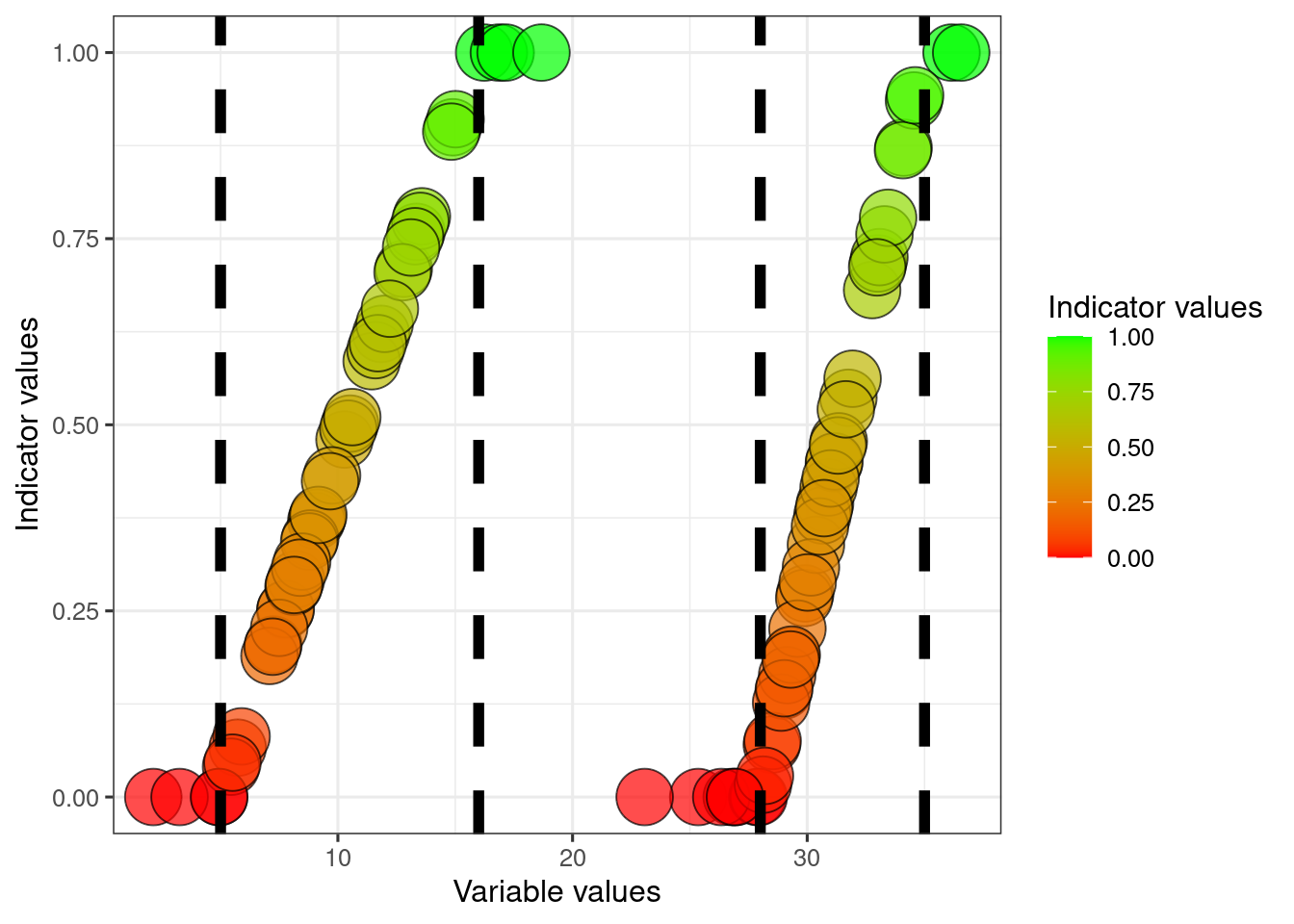
20.3 Break point scaling
We can also define a threshold for good ecological condition. Lets for example say that for variable1, ecosystem function really declines when the variable shows values below 9.
dat$thr1 <- 9Then we can normalise again, using what I refer to as break point normalisation. For the maths, see here.
dat$indicator1_breakPoint <- ifelse(
  dat$variable1 < dat$thr1,
    ((dat$variable1-dat$referenceLow1)/(dat$thr1 - dat$referenceLow1))*(0.6-0)+0,
    ((dat$variable1-dat$thr1)/(dat$referenceHigh1 - dat$thr1))*(1-0.6)+0.6
  )

dat$indicator1_breakPoint[dat$indicator1_breakPoint<0] <- 0
dat$indicator1_breakPoint[dat$indicator1_breakPoint>1] <- 1
ggplot(dat)+
  geom_point(
    aes(x = variable1, y = indicator1_breakPoint, fill = indicator1_breakPoint),
             colour = myColour,
             size   = mySize,
             alpha  = myAlpha,
             shape  = myShape)+
  geom_vline(xintercept = dat$referenceHigh1[1],
             linetype = "dashed",
             size =2)+
  geom_vline(xintercept = dat$referenceLow1,
             linetype = "dashed",
             size =2)+
  geom_segment(aes(x = thr1, y = 0, xend = thr1, yend = 0.6),
               linetype="solid",
               size=1.5)+
  geom_segment(aes(x = 0, y = 0.6, xend = thr1, yend = 0.6),
               linetype="solid",
               size=1.5)+

  ylab("Indicator values")+
  xlab("Variable values")+

  scale_fill_gradient("Indicator values", low = low, high = high)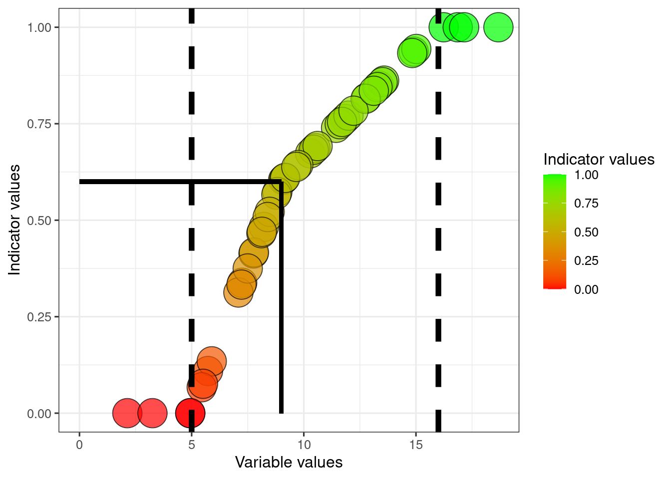
The solid lines point to the indicator value where the variable equals the threshold value.
20.4 Two-sided indicator
An indicator may have an optimum value somewhere in the middle of its range, rather than a max or min value. You can then define a two-sided indicator. Lets say that variable2 is optimal when its at a level of 30, and values either lower or high are both bad.
dat$referenceMid2 <- 30
dat$indicator2_twoSided <- ifelse(
  dat$variable2<dat$referenceMid2,
    (dat$variable2-dat$referenceLow2)/(dat$referenceMid2-dat$referenceLow2),
    ((dat$variable2-dat$referenceMid2)/(dat$referenceHigh2-dat$referenceMid2))*(-1)+1
  )

# truncating
dat$indicator2_twoSided[dat$indicator2_twoSided<0] <- 0
dat$indicator2_twoSided[dat$indicator2_twoSided>1] <- 1
ggplot(dat)+
  geom_point(
    aes(x = variable2, y = indicator2_twoSided, fill = indicator2_twoSided),
             colour = myColour,
             size   = mySize,
             alpha  = myAlpha,
             shape  = myShape)+
  geom_vline(xintercept = dat$referenceMid2[1],
             linetype = "dashed",
             size =2)+
  geom_vline(xintercept = dat$referenceLow2[1],
             linetype = "dashed",
             size =2)+
  geom_vline(xintercept = dat$referenceHigh2[1],
             linetype = "dashed",
             size =2)+

  ylab("Indicator values")+
  xlab("Variable values")+

  scale_fill_gradient("Indicator values", low = low, high = high)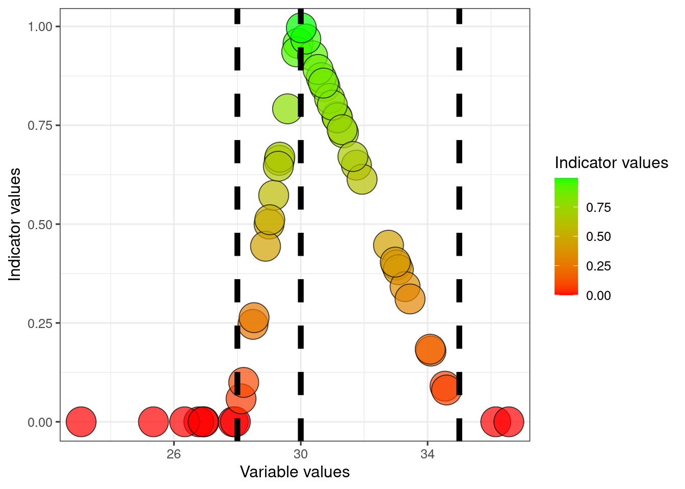
20.5 Sigmoid transformation
There are many other, non-linear ways to normalise an indicator. The correct choice for scaling function varies between indicators and depends on the nature of the indicator and what it represents, but also on the uncertainty around the reference values. Personally, I think the sigmoid function often makes a lot a sense. It is less sensitive to changes around the min and max reference values. A slight deviation from the reference condition should perhaps not often not be described as a true reduction in condition. This is true for example when reference communities (ecosystems defined as having, or representing, good condition) themselves show variation in the variable values, yet the reference value is fixed. A linear scaling will in these cases lead to what is referred to as underestimation biaz (making thing look worse than they really are).
The equation for the sigmoid transformation that I use here comes from Oliver at al. (2021); Eq. 1, Supplemetary Information S2.
dat$indicator1_sigmoid <- 100.68*(1-exp(-5*(dat$indicator1_LowHigh)^2.5))/100Finding the transformed indicator value when the variable equals the threshold
sigmoid_thr <- 100.68*(1-exp(-5*((dat$thr1[1]-dat$referenceLow1[1])/(dat$referenceHigh1[1]-dat$referenceLow1[1]))^2.5))/100
ggplot(dat)+
  geom_point(
    aes(x = variable1, y = indicator1_sigmoid, fill = indicator1_sigmoid),
             colour = myColour,
             size   = mySize,
             alpha  = myAlpha,
             shape  = myShape)+

  geom_vline(xintercept = dat$referenceLow1[1],
             linetype = "dashed",
             size =2)+
  geom_vline(xintercept = dat$referenceHigh1[1],
             linetype = "dashed",
             size =2)+

  geom_segment(aes(x = thr1, y = 0, xend = thr1, yend = sigmoid_thr),
               linetype="solid",
               size=1)+
  geom_segment(aes(x = 0, y = sigmoid_thr, xend = thr1, yend = sigmoid_thr),
               linetype="solid",
               size=1)+


  ylab("Indicator values")+
  xlab("Variable values")+

  scale_fill_gradient("Indicator values", low = low, high = high)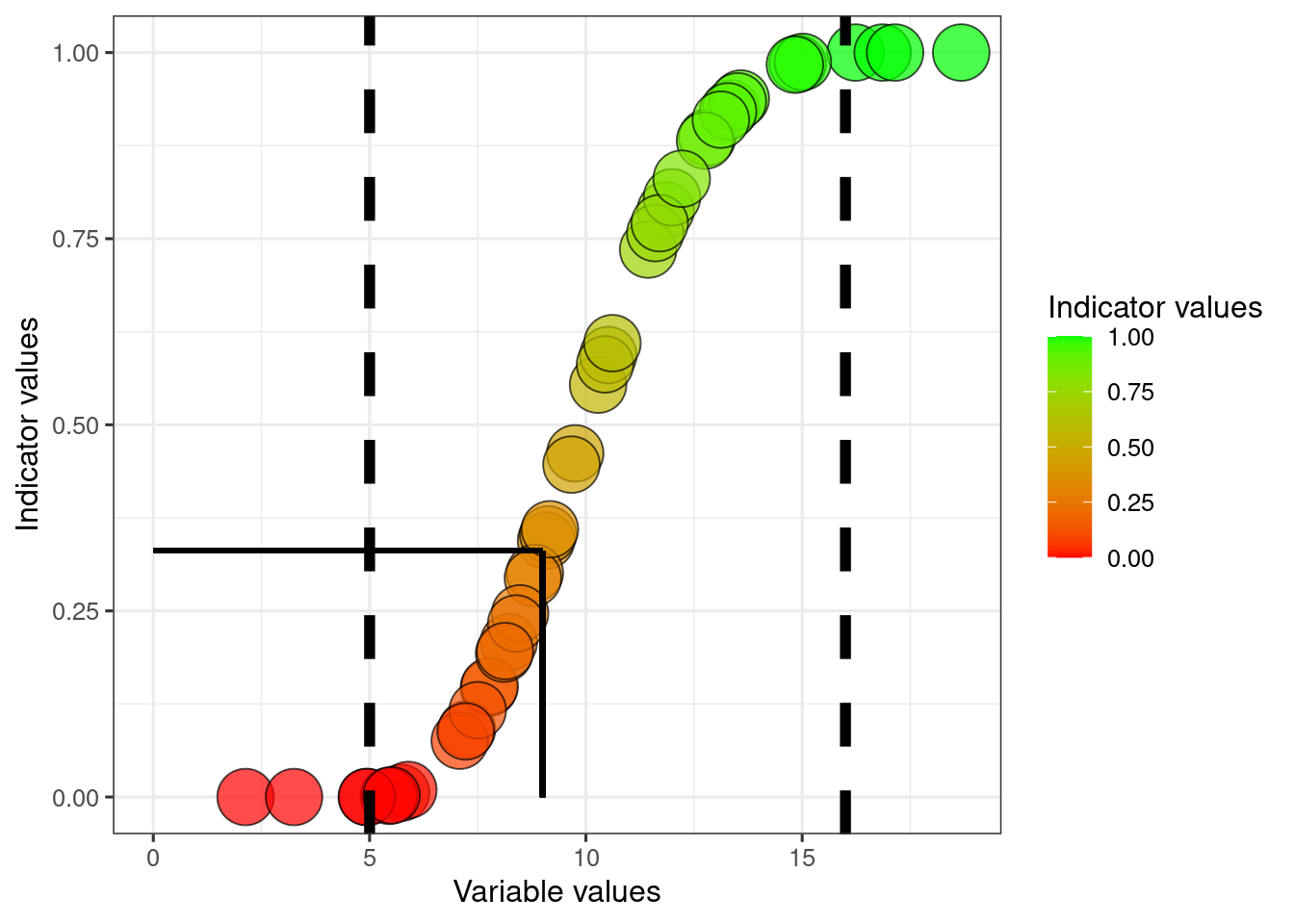
The solid helperlines point to the indicator value where the variable value equals the threshold. Later we will shift the values so that the indicator value becomes 0.6 at this point.
Also plotted against the linearly normalised indicator values:
ggplot(dat)+
  geom_point(
    aes(x = indicator1_LowHigh, y = indicator1_sigmoid, fill = indicator1_sigmoid),
             colour = myColour,
             size   = mySize,
             alpha  = myAlpha,
             shape  = myShape)+

  geom_vline(xintercept = 0.6,
             linetype = "dashed",
             size =2)+
   geom_hline(yintercept = 0.6,
             linetype = "dashed",
             size =2)+

  ylab("Sigmoid-transformed\nIndicator values")+
  xlab("Linear indicatior values")+

  scale_fill_gradient("Indicator values", low = low, high = high)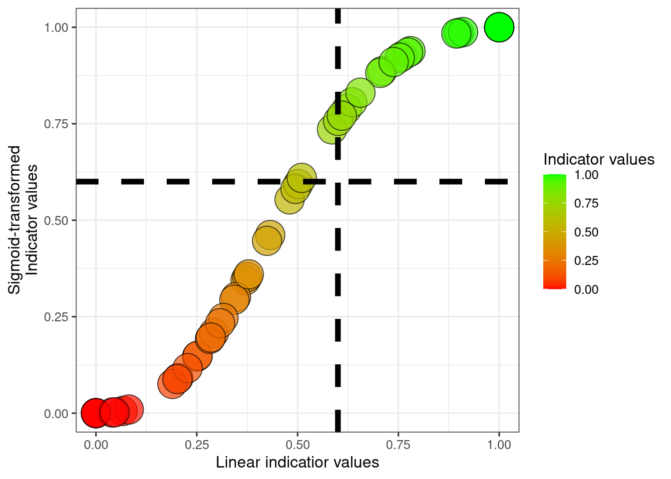
The dotted helper lines selve as visual guides to judge how different a scaled indicator value of 0.6 is for the two approaches.
20.5.1 Accounting for the threshold value
We can account for the threshold for good ecological condition when applying sigmoid transformation like this
dat$indicator1_sigmoid_thr <- ifelse(
  dat$variable1<dat$thr1,
    ((dat$indicator1_sigmoid-0)/(sigmoid_thr-0))*(0.6-0)+0,
    ((dat$indicator1_sigmoid-sigmoid_thr)/(1-sigmoid_thr))*(1-0.6)+0.6
  )
ggplot(dat)+
  geom_point(
    aes(x = variable1, y = indicator1_sigmoid),
             fill   = "grey",
             colour = myColour,
             size   = 5,
             alpha  = myAlpha,
             shape  = myShape)+

  geom_point(
    aes(x = variable1, y = indicator1_sigmoid_thr, fill = indicator1_sigmoid_thr),
             colour = myColour,
             size   = mySize,
             alpha  = myAlpha,
             shape  = myShape)+

  geom_vline(xintercept = dat$referenceLow1[1],
             linetype = "dashed",
             size =1)+
  geom_vline(xintercept = dat$referenceHigh1[1],
             linetype = "dashed",
             size =1)+

  geom_segment(aes(x = 0, y = sigmoid_thr, xend = thr1, yend = sigmoid_thr),
               linetype="solid",
               colour = "grey",
               size=1)+

  geom_segment(aes(x = thr1, y = 0, xend = thr1, yend = 0.6),
               linetype="solid",
               size=1)+
  geom_segment(aes(x = 0, y = 0.6, xend = thr1, yend = 0.6),
               linetype="solid",
               size=1)+


  ylab("Indicator values")+
  xlab("Variable values")+

  scale_fill_gradient("Indicator values", low = low, high = high)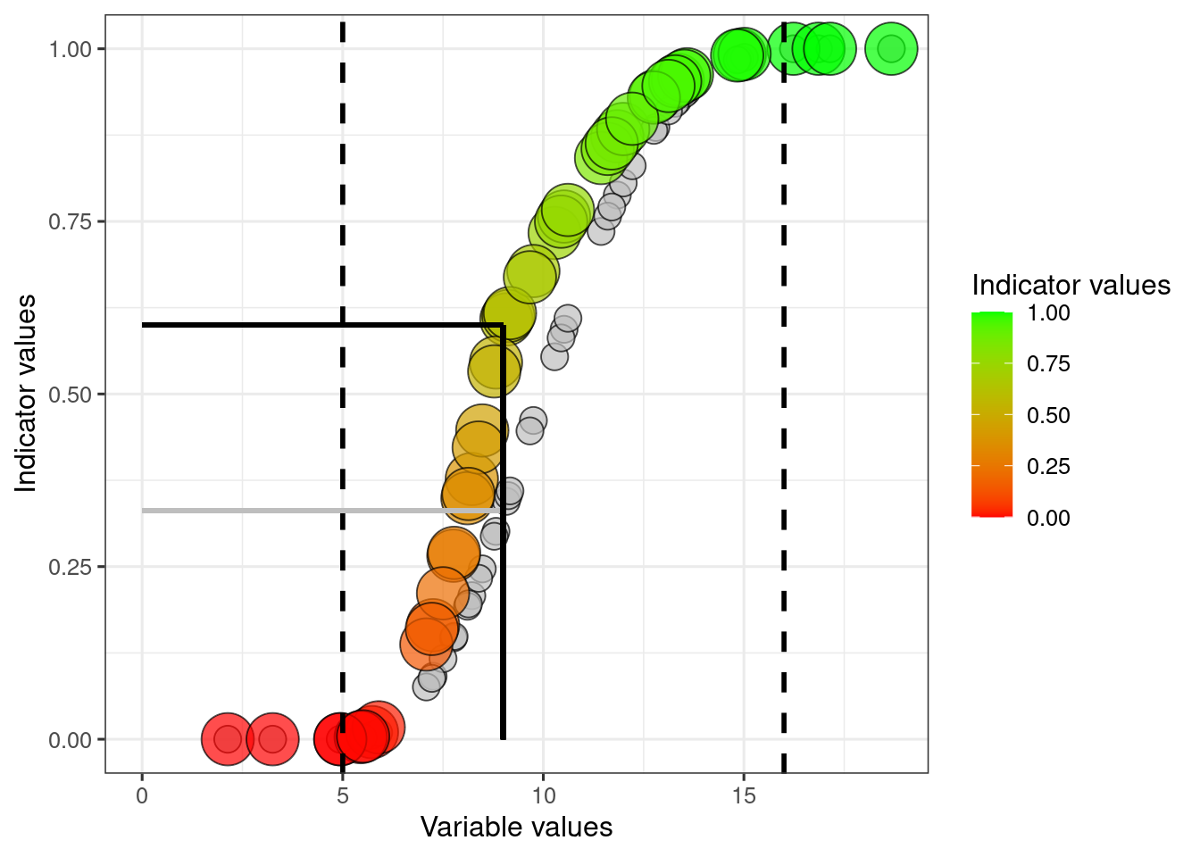
The grey circles and horizonal line correspons to the sigmoid transformation without any adjustment for the threshold value.
20.6 Exponential functoins
Here are two examples of exponential transformation that can also be used:
dat$indicator1_expConvex <- dat$indicator1_LowHigh^0.5
dat$indicator1_expConcave <- dat$indicator1_LowHigh^2
ggplot(dat)+
  geom_point(
    aes(x = variable1, y = indicator1_expConvex, fill = indicator1_expConvex),
             colour = myColour,
             size   = mySize,
             alpha  = myAlpha,
             shape  = myShape)+
  geom_point(
    aes(x = variable1, y = indicator1_expConcave, fill = indicator1_expConcave),
             colour = myColour,
             size   = mySize,
             alpha  = myAlpha,
             shape  = myShape)+

  geom_vline(xintercept = dat$referenceLow1[1],
             linetype = "dashed",
             size =1)+
  geom_vline(xintercept = dat$referenceHigh1[1],
             linetype = "dashed",
             size =1)+
  ylab("Indicator values")+
  xlab("Variable values")+

  scale_fill_gradient("Indicator values", low = low, high = high)